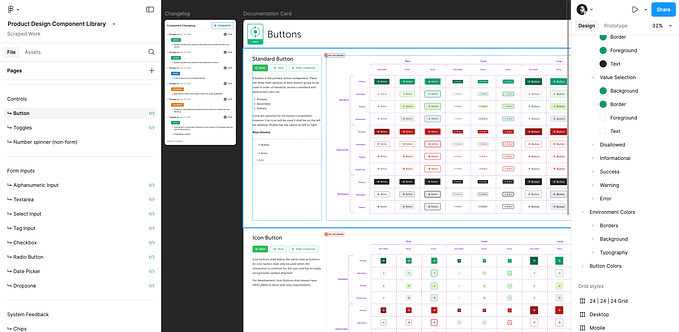
Measuring Design System Adoption: Building a Visual Coverage Analyzer

“How much of our product actually uses our design system?”
This seemingly simple question is one I face constantly as the product manager for Cedar, REI’s design system. While straightforward to ask, it’s surprisingly difficult to answer with precision. It inevitably surfaces in stakeholder meetings and planning sessions, particularly when we’re discussing adoption metrics, measuring progress, or demonstrating impact.
While we have good data tracking individual component usage, we’ve lacked visibility into the bigger picture: what percentage of our digital interfaces were actually built with Cedar components versus custom solutions? This distinction matters because usage alone — counting instances of components — only tells part of the story. The missing dimension was coverage — understanding how much of our overall UI landscape was powered by the design system.
I’ve found two complementary core health metrics that provide valuable insights for design systems:
- Usage: How often components are being implemented across products
- Coverage: What percentage of the total interface is built with system components
These metrics work together to tell the complete story. Usage shows adoption breadth — which components are being used and how frequently. Coverage reveals adoption depth — how thoroughly the design system has been integrated into the product.
The distinction matters because they measure different aspects of success. A product team might use your button component extensively (high usage), but if they’re building everything else custom (low coverage), you’re not achieving the consistency and efficiency benefits that design systems promise.
In a previous article on measuring design system value, I explored how outcomes matter more than output when evaluating design systems. While that piece focused on qualitative measures like improved collaboration and designer/developer productivity, I’ve found that having objective, quantitative data is equally crucial. Coverage metrics provide that concrete evidence of adoption.
With this understanding, I needed a solution that would help us set an accurate baseline of current state coverage, track progress, identify gaps, and ultimately demonstrate the value of Cedar to the organization. And I needed to do it without waiting for dedicated engineering time — a familiar challenge for product managers looking to move forward quickly.
Initial Approach
My first instinct was to track adoption through code analysis. Cedar components are easy to identify in code with their ‘cdr-’ prefix, and we can capture their usage through database queries. But there was a significant blindspot: we had no visibility into custom components built by product teams. Without this data, we couldn’t calculate the true ratio of design system to custom components.
In his article “Where to Put One-Off Components,” Brad Frost proposes using consistent component prefixes to distinguish between design system and custom components. While elegant in its simplicity, this approach would require standardizing naming conventions across all our product teams — an extensive coordination effort since our custom components lack consistent naming patterns.
Pivoting to Visual Analysis
With code analysis presenting too many obstacles, I started looking for alternative approaches that wouldn’t require changes to our development workflow. What if instead of trying to identify components in the code, I could visually analyze them in the browser where they’re rendered?
I was inspired by Preply’s approach to visual coverage analysis. They had developed robust, custom tooling to track their design system component usage and feeding it into custom reporting dashboards.
This got me thinking about extending a tool I already had: a simple Chrome extension using Stylebot that I’d created to highlight Cedar components across rei.com.


This basic tool gave me a visual way to quickly spot Cedar components on any page and color-coded which version was in use, but it was limited to simple highlighting without any metrics or analysis capabilities. What I needed was a way to identify both Cedar components AND custom components, then calculate the ratio between them — giving me the complete coverage picture.
The key insight was realizing I could build on this concept to also capture custom components — the missing piece of our coverage equation.
I wondered if I could build this myself with the help of AI tools. I was curious how much these tools could help someone with limited coding experience create something genuinely useful.
Building the Analyzer
With my goal clear, I began collaborating with Claude to develop a Chrome extension that gives us visibility into design system coverage. The extension does two key things: it visually maps our component ecosystem and provides quantitative metrics we can track over time.
The analyzer visually identifies components with:
- Cedar components highlighted with blue outlines
- Custom components marked with red outlines
- Component name labels for easy identification


Beyond visual identification, it provides interactive controls that allow us to:
- Toggle visibility of different component types (Cedar vs. custom)
- Calculate coverage percentages in real-time
- Export detailed component lists for deeper analysis

Refinements Through Testing
One immediate benefit of using a browser extension was the ability to test and refine in real-time. Each iteration revealed new insights and opportunities for improvement.
Early testing showed that since Cedar components are often the atomic building blocks of custom components, it was difficult to parse which elements were being highlighted. To solve this, I added component name labels that make it immediately clear what each highlighted element represents.

I also realized that including global navigation and footer elements — which are consistent across pages — was skewing my metrics, so I excluded these elements to focus on page-specific components.
When looking at multiple pages, it became clear that I needed to track this information systematically. I added a CSV export function that enables us to generate component data reports across our key pages on a quarterly or ad-hoc basis, and calculate average coverage values across the entire ecosystem.
The most challenging aspect was accurately detecting custom components. Through multiple iterations, I refined the detection methods to capture the wide variety of non-Cedar components scattered throughout our products.
What makes this approach particularly valuable is how quickly I can implement new refinements as we learn more. Unlike traditional development projects that might require planning cycles and engineering resources, I can adjust detection rules or add new features in minutes rather than weeks. This flexibility allows the tool to evolve alongside our understanding of what metrics matter most.
Results and Impact
The analyzer revealed a current baseline of 61.9% Cedar coverage across key pages — establishing a solid quantitative measure of design system coverage. This number was both encouraging and motivating, giving me a metric I can track over time to show the direct impact of our design system work.

The value goes beyond just the numbers. This solution has transformed how I approach design system adoption:
- I can instantly identify where product teams are using custom components that might have Cedar alternatives
- Roadmap planning is now grounded in real data about which components need development or migration
- I can set realistic adoption targets based on actual usage patterns
- Stakeholder conversations have shifted from abstract discussions about value to concrete metrics about progress
The tool serves dual purposes in these conversations:
- For product teams, the visual overlay creates a tangible artifact we can review together, showing exactly where custom components could be replaced with Cedar alternatives.
- For leadership, the coverage metrics provide clear KPIs that demonstrate progress without getting into technical details. This approach helps me tailor discussions to the audience while maintaining a consistent message about increasing Cedar adoption across our products.
Looking Forward: Beyond Metrics
This project reinforced valuable lessons about problem-solving that extend far beyond design systems: sometimes the most practical solution isn’t the most technically sophisticated one.
By focusing on my specific needs rather than waiting for resources to build a “perfect” solution, I created a tool that delivers immediate value while requiring minimal engineering support. The browser extension approach gave me the flexibility to iterate quickly, test widely, and adapt based on feedback.
Perhaps most importantly, this process demonstrated how product teams of all kinds can leverage creative approaches and modern tools to overcome resource constraints without compromising on quality or impact. The ability to build lightweight solutions that address specific measurement challenges is a skill that translates across product domains.
So when someone asks me, “How much of your product actually uses your design system?” — I no longer have to guess. I have data that answers not just how many components are being used, but how much of our interface is truly built on our design system. This isn’t just measuring activity; it’s measuring what matters.
Let’s Connect
Have you tried measuring design system coverage at your organization? I’d love to hear about your approach! If you implement a similar visual analysis tool or have other creative solutions for tracking design system metrics, please share your experience.
I’m always interested in connecting with other design system practitioners to exchange ideas and learn from each other. Whether you have questions about this approach, feedback on the method, or just want to chat about design systems in general, reach out to me on LinkedIn or drop a comment below.